The formatting of the blog posting may be odd if you are reading this in a Feed Reader or via e-mail distribution, so click on the title above (which is an active link) to view the website version.
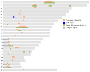
FIGURE 1: Positions of Centromeres, Regions of Excess IBD, HLA Region, and SNP-Poor Regions (Build 36)
|
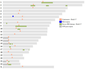
FIGURE 2: Positions of Centromeres, Regions of Excess IBD, HLA Region, and SNP-Poor Regions (Build 37)
|
I do a lot of chromosome mapping using Kitty Cooper's great Ancestor Mapping Tool. There are a few regions in the genome more likely to have issues when comparing matching DNA segments with others: at the centromeres and regions of excess IBD sharing (IBD = identical by descent). Instead of looking these up in tables, I've plotted them on chromosome maps, as visual representations are easier than looking up values in a table and they allow side-by-side comparisons to be made to my chromosome maps. I also added the Human Leukocyte Antigen (HLA) region on chromosome 6, which exhibits greater IBD sharing than expected, and the SNP-poor regions (SNP = single nucleotide polypeptide) rather than having blank areas on the chromosome map.


