All my known ancestors (some back to the 1500's) were from the United Kingdom, so making a pie chart illustrating just this is pretty uninteresting: a single whole pie of 100% UK. Many other people have much more variable and exotic ancestral origins. However, on coming across an Excel spreadsheet with Ancestry Pie Charts created by John Tierny (under a Creative Commons license), I had another idea: to split up my ancestry into countries within the UK where my ancestors originated: England, Wales, Scotland, and the Isle of Man (the Isle of Man is strictly a Dependancy of the UK) – or to subdivide further by county. I originate from 10 counties/areas + one Unknown (see My Brick Walls and last blog posting on Frederick Woolfall and the Diamond Ring "Hush Money"): 18.75% from Lancashire; 12.5% each from Anglesey, Caernarvonshire, Cumberland, and Shropshire; 9.375% from Devon; 6.25% each from the Isle of Man and Unknown (probably Lancashire or somewhere else in the UK); and 3.125% each from Cornwall, Selkirkshire, and Dumfries-shire. But all of these 11 counties with similar-sized "slices" seemed like too much granularity for pie charts, so I opted to use countries within the UK.
With John Tierny's spreadsheet, you fill in the ancestry of all 16 of your 2nd great-grandparents, and everything forwards is calculated automatically from there. There are columns for up to 10 "regions", and these can be customized (don't miss the note in the Info. on the 1st worksheet for how to unprotect the worksheets, which allows for customization). My pie charts are shown below. I tweaked a few things on the original spreadsheets to have colours and formatting to my liking, and added some drop shadows to the pie charts.
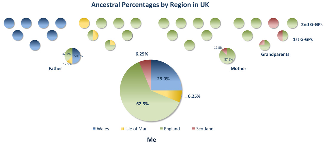
Click for larger version (Source: Modified from Excel spreadsheet available at http://currach.johnjtierney.com/2011/07/ancestry-pie/)
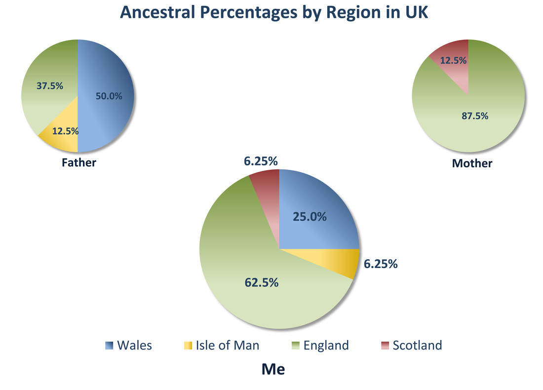 Click for larger version (Source: Modified from Excel spreadsheet available at http://currach.johnjtierney.com/2011/07/ancestry-pie/) | These pie charts broken out by UK countries certainly make my ancestral origins appear a little more interesting than each blob being exactly the same colour and just representing the "UK". Before going through this exercise, I'd never actually given much thought to this, even though everything would have been easy to calculate based on the information on my family tree. Thanks, John, for making your Ancestry Percentage Spreadsheet available. |
What's New on GenealogyJunkie.net
- Nothing significant since my last blog posting, Frederick Woolfall and the Diamond Ring "Hush Money" (20 August 2013)
- I'm continuing to add to DNA Tips, Tools, & Managing Matches – last updated 27 August 2013. Don't miss the link there for 13 short "lessons" by Kelly Wheaton in her Beginner's Guide to Genetic Genealogy – she wrote this about 3-4 months too late for me to have maximum benefit!


